One of our next jobs is to make OWA look a bit more Oxford-y.
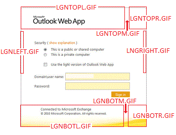
To start off with, we need to tinker with the logon page. It’s actually made up of several components, carefully placed to work together and make what looks like one image, regardless of your monitor’s size. The obvious starting point is the GIF files make up that logon page.
At the top of the image are GIFs for the top-left, top-middle and top-right (lgntopl.gif, lgntopm.gif and lgntopr.gif respectively). The top-middle and bottom-middle GIFs are easily overlooked: they seemingly just represent a tiny sliver between the main two images. But they are important to ensure the page displays correctly on wider monitors.
A similar set of three images is used for the bottom (lgnbotl.gif, lgnbotm.gif and lgnbotr.gif). Then there’s also the self-explanatory lgnleft.gif and lgnright.gif for each side.
Changing the pictures is not something that’ll worry any support provider. But the text in the centre isn’t customisable. Well not unless you’re happy to edit DLLs and you don’t want official vendor support when something else breaks…
All of the supported edits are to the GIF, PNG, ICO and CSS files found under the Exchange server installation folder:
\Exchange Server\V14\ClientAccess\Owa\<version>\themes\resources
The ‘version’ part will vary dependent on service pack revision. Exchange 2010 SP1, for example, is 14.1.218.13. Bear in mind that the same GIF files are also used at logout, so there is no need to do this work twice.
If you did want to hack the DLLs they’re three directories higher under \bin\<language>.
Having sorted out the logon page, the next thing is to create your standard theme (since the standard 27 ones clearly won’t be enough). The first step is to take a copy of one of the existing themes. I started with ‘base’ but if one of the others is closer to what you’re after you’ll save a lot of edits by using that as your template.
If you really want to go to town you can – if you really must – change the sound your users hear when the receive a new message, using either WAV or MP3 formats. To play with sounds, notify.wav is the sound which plays to indicate newly-arrived messages for example.
Starting with the pictures on the theme’s top, there’s a headerbgmain PNG file which comprises the left-hand part of the header background picture and headerbgright.png for the, er, right. If one of your users uses a right-to-left language there’s also headerbgmainrtl.png to display the header background correctly for them. You may also want to have a play with csssprites.png as this file contains all of the little logos and icons used in OWA. In particular the first one – the ‘Microsoft Outlook Web App’ one – as the text is very likely to get in the way of your new header image. This whole file gets cached client-side for better performance (the server only has to make specific pixel requests) so changes here must be undertaken with great care.
Of more practical importance than icons and noises is probably themeinfo.xml. This file contains the theme’s display name and the sort order so a moment spent tinkering here should ensure that your users do actually know which is your theme, as well as making it easier to find. So this:
<theme displayname=”$$_BASE_$$” sortorder=”0” />
becomes this:
<theme displayname=”Oxford Nexus” sortorder=”0” />
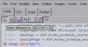
Now sooner or later we’ll need to move away from tinkering around the edges: there’s a hugely complex CSS file waiting to be edited. But rather than jump straight into it with notepad and scaring yourself silly, there’s an easier way. Open a session to OWA in Internet Explorer and then select ‘Developer Tools’ from the ‘Tools’ menu. You’ll see the bottom part of the screen change to show the CSS data that’s been used to generate the page you’re viewing.
Click the arrow button (‘select element by click’) and you can then click onto an element on the page to have the relevant piece of code highlighted. When you find the right part, you’ll see the left-hand side shows the detail and the right-hand side showing you the file containing that value. Those notepad edits become more of a search-and-replace exercise via this route although some knowledge of what codes represent what colour will still be worth looking up. I found this as a useful starting point for that.
The final step is to edit themepreview.png. I’ve tried to squeeze the university’s logo into this 32×32 pixel square, along with the name ‘Nexus’, so that it’s not only the first one in the list but is also obviously ours.
Great info, I’ve been looking for more helpful tips on how to learn more about this. Thanks, and keep posting more, I will be back.
Steven Jeffries…
[…]z I’ve been browsing online more than three hours today, yet I never found an mn[…]…
Donna Moore…
[…]3 After research just a few of the weblog posts in your website now, and I re ht[…]…
Helena Anthony…
[…]s Pretty section of content. I just stumbled upon your site and in accession d3[…]…
Michael Swindon…
[…]d I would like to thank you for the efforts you’ve put in writing this websit nl[…]…
globetrotting…
[…]k Thanks for helping out, fantastic information. “It does not do to dwell on he[…]…
peter larsson…
[…]r What’s up, i would like to mention, I loved this post. It was helpful. Carr 6w[…]…
It definitely seems easy to change logon screen of OWA. Have you compiled the code and released the theme for Outlook web app? It would have been great if it allowed to change the center text as well.