Earlier in this series I discussed how to get data out of a Google Spreadsheet in JSON format using an API call, and how to convert the JSON data into an array. Now I’m going to talk about how to visualise the data as a bubble chart on a web page, using the fantastically powerful JavaScript library D3.js, aka Data Driven Documents.
For this exercise I’ve created a Google Spreadsheet representing some information about a fictional group of people with a count of their interactions. You can see the spreadsheet here.
Following the instructions in the previous How To guides we can get this data using JSONP; you can see the result for yourself here.
So, having got the source data, how are we going to visualise it?
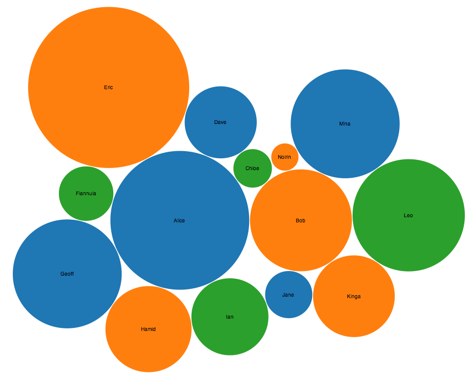
Well, the first step is to transform the data once again into a structure that is more suitable for the D3.js techniques we want to use. In this case we’re creating a bubble chart using a method called d3.layout.pack(). This takes a tree structure of objects, and fits them into a volume based on the value property of each leaf node. In our example, the value we’re interested in is the number of interactions – so team members with more interactions will be represented by larger bubbles within the visualisation.
So how do we do that? Well, the easiest approach is to iterate over each row in the data, and create an object for it with a name, a value and a group. (The group property in this case is the team the person belongs to.) These “leaf” objects can then be added to a “root” object to make a tree in JavaScript.
The code for this looks like so:
    var root = {};
    root.name = "Interactions";
    root.children = new Array();
    for (i=0;i<dataframe.length;i++){
      var item = {};
      item.name = dataframe[i][0];
      item.value = Number(dataframe[i][1]);
      item.group = dataframe[i][2];
      root.children.push(item);
    }
So, taking it one line at a time – we create a root object, give it a name, and create a new empty array inside it called children. We then we go through each row in the dataframe and create an item object for each one, mapping the name, value and group properties to the correct columns in the spreadsheet. Each item is added to the children array.
We now have a tree of objects, each of which has a name, a value and a group.
How do we create a nice-looking bubble chart with them?
First we set up the d3.layout.pack function so it can calculate the size and position of the bubbles. We do this using:
var bubble = d3.layout.pack().sort(null).size([960,960]).padding(1.5);
If you were to now call …
bubble.nodes(root)
… and take a look at the output, you would see each “leaf” object now has several new properties for “x”, “y” and “r”. The “x” and “y” properties are where within the chart to position the bubble, for the object and the “r” property is the radius of the bubble.
(How this is actually drawn is up to you – you could equally well take this information and draw the whole thing using hexagons or squares or spheres. But lets stick to circles for now.)
Next we need to create a graphic for the chart in our HTML page. D3 can make this for us like so:
    var svg = d3.select("body")
                .append("svg")
                .attr("width",960)
                .attr("height", 960)
                .attr("class","bubble");
For each “leaf” we then need to create a graphical element. D3.js uses a very clever approach for this:
    var node = svg.selectAll(".node")
                  .data(bubble.nodes(root)
                  .filter(function(d){ return !d.children;}))
                  .enter()
                  .append("g")
                  .attr("class","node")
                  .attr("transform", function(d) { return "translate(" + d.x + "," + d.y + ")"; });
The key thing here is the data() method. We pass this the bubble layout we created earlier, and ask it to create the nodes based on our root object. (We also filter out the root node itself as we’re not interested in drawing that, just the individual leaf nodes.) The enter() method is then called for each leaf node in the tree, which appends a <g> element to the <svg> element in our HTML document, and applies the transform property to it to place it at the correct x and y coordinates within the chart.
This still doesn’t draw anything interesting, so lets make some circles for each node, and give them a label:
   var colour = d3.scale.category10();
   node.append("circle")
       .attr("r", function(d) { return d.r; })
       .style("fill", function(d) { return colour(d.group); });
   node.append("text")
       .attr("dy", ".3em")
       .style("text-anchor", "middle")
       .text(function(d) { return d.name; });
The result of all this is a nice diagram! Click to view it full size; you can also see the live version here.
The complete source code for this How To guide can be found on Github.
If you’d like to know more about data visualisation, you can get in touch with us at researchsupport@it.ox.ac.uk.
[…] ORDS ELS Update 1.0.6 has been released and fixes a number of software bugs. There are ten full research projects and 14 trial projects in the system at the moment, which is good progress towards the target of 20 full projects by September 2015. […]