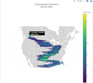
Static version of an interactive plot.ly map showing precipitation on 30th June in 2015; please click image to go to the interactive version.
The Live Data project aims to support academics in creating interactive visualisations using a variety of cloud-based visualisation services that can be embedded within academic journal articles, blogs and websites. To achieve this the project has been funded from October 2015 to March 2017 by the Research IT Board to build visualisation case studies from across the University and to develop software agnostic workflows for the creation of interactive visualisations.
IT Services has committed to providing a service to support academics in creating interactive data visualisations thanks to the lessons learned from the Live Data Project. To find out more, visit the Interactive Data Network (IDN) website; this site provides the following resources:
- Overview of data visualisation technologies
- Information on the University’s shinyapps.io subscription for hosting data visualisations
- Example case studies developed through the Live Data project
- Technical training materials on how to re-use Shiny app templates
- A calendar of events dedicated to Open Data and the usage of interactive visualisation as research impact.
The team responsible for delivering the Live Data project included; Howard Noble (sponsor), Martin Hadley (PM and technical lead), Ken Kahn (developer) and Rowan Wilson (3d visualization and Blender expert).
[…] Live Data Project will provide data visualisation as a service to researchers across the University – encouraging […]
[…] team’s work on supporting researchers in creating interactive visualisations through the Live Data […]