
Our project (run within the Research Technology Consultancy in IT Services) looked at ways that IT Services could improve its support for managing and visualising 3D datasets generated by research here at Oxford. There are powerful free tools out there (for example Blender and three.js) both for offline and interactive rendering of this kind of data, but they tend not to work natively with the kind of data our research generates. Our project, along with the Live Data project looked at innovative ways to make datasets accessible to a wider audience, and make that access more impactful.

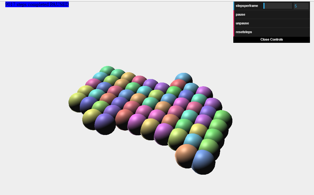
To achieve this for 3D data, we needed to gain skills in using the tools in question, as well as writing scripts to convert the data into formats the tools could use. Tools like potree (above) provide strong visualisation tools right in the browser using webgl and require only minimal adaptation of the data to provide good results. In other cases, we had to do more of the heavy lifting in our own scripting, as in this example from as yest unpublished research that provided tools to animate and examine a physical process in the browser:
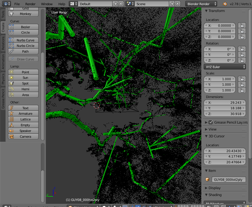
Using the free/open source 3D modelling and rendering tool Blender, we wrote scripts to convert research data generated by LIDAR scanners and bespoke physical simulations (via Paraview). At the same time we introduced and iterated on an ITLC course in the use of Blender. This not only helps researchers gain skills in using the software, it helps us identify needs in the research community at Oxford.
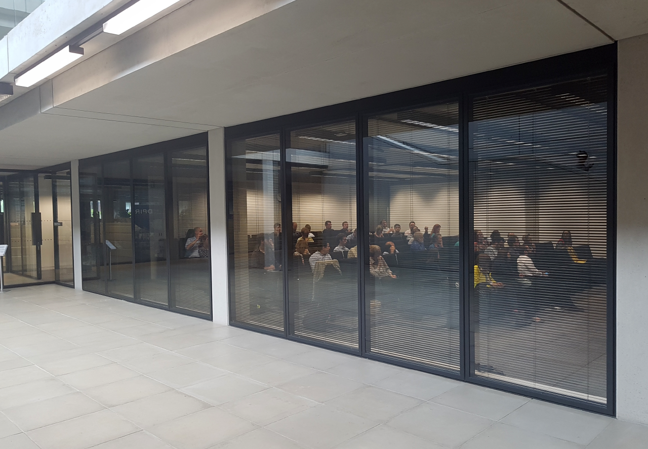
We also held an extremely well attended (and well reviewed) event to discuss all aspects of Data Visualisation and how it fits into the future of academic publication. 

Looking forward, we intend to make 3D data visualisation into one of the topics on which we can provide support to researchers as part of the Interactive Data Network. We also received strong support for the idea of further data visualisation events held in Oxford, with a greater focus on practical wrangling of datasets into interactive visual forms. We hope to announce a further event in the near future.