Introduction
During the JANET Carrrier Ethernet Trial we we took part in, I needed to plot some data based on our testing and came across gnuplot. It is actually quite simple to use and we’re doing so more and more so I thought I share some of what I’ve learned.
Process
First you need to generate a text file of data which you wish to graph (whitespace is fine as a delimiter).
Here is a sample of some data I created. It is the number of unique users of OWL Visitor (our guest wireless service) per day:
2011-08-17 670
2011-08-18 666
2011-08-19 619
2011-08-20 470
2011-08-21 368
Install gnuplog on the server you are using. At the time of writing it available natively in RedHat and Debian. You need to generate a config file, # man gnuplot is your friend here.
# gnuplot script file for plotting bandwidth over time
#!/usr/bin/gnuplot
reset
set terminal png

set xdata time
set timefmt "%Y-%m-%dT%H:%M:%S"
set format x "%d/%m"

set xlabel "Date (day/month)"
set ylabel "Number of uniqe visitor users"

set title "Visitor Users over time"
set key below
set grid

plot "/home/networks/unique_visitors.csv" using 1:2 title "Visitors"
Hopefully the config file above is fairly self explanatory. To generate the graph simply run the following:
/usr/bin/gnuplot visitor_users.gp > /home/networks/visitor_users.png
Where visitor_users.gp is the name of the config file above. Here is the result, using a larger dataset:
You can then use a cronjob to update the data and replot the graph regularly.
Using variables in the config file
If you would like to manipulate the data you are plotting on the fly, for example to scale something down, you can. An example is probably best here.
Here is a small subset of the data:
2011-08-01T09:10:03 31106 630881 15746233 27439 609104 15924148 128 8133029 32533776
2011-08-01T09:20:04 31106 630929 15747201 27439 609152 15925609 128 8133029 32533776
2011-08-01T09:30:03 31106 631020 15750202 27447 609203 15928230 128 8144560 32584722
2011-08-01T09:40:03 31106 631078 15751874 27453 609238 15930112 128 8144560 32584722
2011-08-01T10:00:03 31110 631196 15754712 27455 609310 15933583 128 112198088 40867109
2011-08-01T10:10:03 31115 631354 15760272 27455 609333 15935724 128 112203231 40895646
2011-08-01T10:20:02 31117 631425 15763701 27460 609471 15941256 128 112203231 40895646
2011-08-01T10:30:03 31121 631558 15766657 27461 609489 15943780 128 112204920 40903491
and the config:
#!/usr/bin/gnuplot
reset
set terminal png

set xdata time
set timefmt "%Y-%m-%dT%H:%M:%S"
set format x "%d/%m"

set xlabel "Date (day/month)"
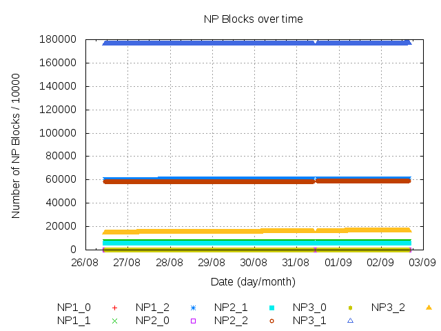
set ylabel "Number of NP Blocks / 10000"
# set ylabel "Number of NP Blocks / 10000 (log)"
# set log y

set title "NP Blocks over time"
set key below
set grid

plot "/home/netdisco/np-blocks.csv" using 1:($2/10000) title "NP1_0" , \
"" using 1:($3/10000) title "NP1_1", \
"" using 1:($4/10000) title "NP1_2", \
"" using 1:($5/10000) title "NP2_0", \
"" using 1:($6/10000) title "NP2_1", \
"" using 1:($7/10000) title "NP2_2", \
"" using 1:($8/10000) title "NP3_0", \
"" using 1:($9/10000) title "NP3_1", \
"" using 1:($10/10000) title "NP3_2"
Again, here is the result:
Hopefully that has been a useful primer on gnuplot, happy graphing!


Yay; statistics!
As part of the JISC Open to Change project I’ve been working on a data store and public API for time-series data. At the moment it’s just got electricity meter data, but it would be great if we could include other types of data. Do you think it’d be possible to get hourly or daily usage statistics (e.g. OWL-Visitor, Eduroam, and network usage) to load into the store?
At the moment we haven’t done much with the data we have, but there is a demonstration graphing tool available. [Sorry to people outside the University network; this is still in closed beta]