For the past few months my colleague John and I have been trying to explain the inner most details of the new eduroam service, how it’s put together, how it runs and how it’s managed. These posts haven’t shied away from the technical detail, to the point that John’s posts require a base knowledge of Cisco IOS that I do not have.
This post is different in that it is aimed at a wider audience, and I hope that even non-technical people may find it interesting and useful. Even if I do throw in the odd TLA or E-TLA, for the most part understanding them is not necessary and I will try to keep these to a minimum.
Background: the software
The rollout of the new eduroam happily coincided with the introduction of a new monitoring platform here in the networks team, Zabbix. Zabbix replaced an old system that was proving to be erratic and temperamental, and we are finding it very useful, both for alerting and for presenting collected information in an easily digestable format. One of its very nice features is that it graphs everything it can, to the point that it is very difficult to monitor something that it refuses to graph (text is pretty much the only thing it doesn’t graph. Even boolean values are graphed.)
While there was a certain amount of configuration involved to get to the stage I can present the graphs below, I will not be covering that. If anyone is interested, please write a comment and I will perhaps write an accompanying post which fleshes out the detail.
Also included in the list of “what I will not discuss here” is the topic of alerting which is where we here in the Networks team are alerted to anomolous values discovered during Zabbix’s routine monitoring. Zabbix does do alerting and, from what we have experienced, it is fairly competent at it. However, alerting doesn’t make pretty graphs.
Where possible, I have changed the names of colleges and departments, just so I cannot be accused of favouritism. The graphs are genuine, even if the names have been changed.
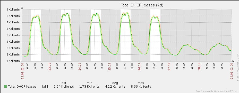
Number of people connecting at any one time
When you connect to eduroam, you are assigned an IP address. This address assigned to the client is from a pool of addresses on a central server and is unique across all of Oxford University’s eduroam service. When you disconnect, this IP address allocation on the server expires after a timeout and is returned to the pool of available addresses to be handed out. With a sufficiently short timeout (i.e. the time between you disconnecting and the allocation expiring on the server), you can get a fairly accurate feel for how many people are connected to eduroam at any one time by querying how many active IP addresses there are in the pool.
This is a look at an average week outside of term time:
This is what an average week looks like inside of term time:
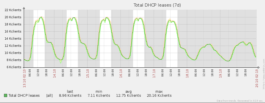
As you can see from the graphs, Zabbix scales and automatically calculates the maximum, minimum and mean values for all graphs it plots. When we say that up to 20,000 clients are connected simultaneously on eduroam, here is some corroborative evidence.
This particular graph is really for our own interest; while we monitor the number of unique clients, there are no alerts associated with this number, as the maximum number of unique addresses is sufficiently large that using all of them is unlikely (approximately 1 million). What we do monitor with appropriate alerting are the IP address pools associated with each unit (college, department and central eduroam offering.) The central pool of IP addresses is split into subpools of predefined size and assigned to different locations (not always physical).
The following is an example.
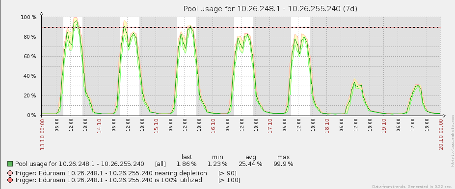
Here we graph not the number of connected clients, but the subpool utilization, which is more useful to us for alerting as 100% utilization means that no more clients can connect using that subpool.
The example above is a subpool for one of our central eduroam offerings. As you can see from its title, this subpool contains addresses between 10.26.248.1 and 10.26.255.240 (2030 addresses) and we are approaching 100% IP address utilization at peak times. We will be remedying this shortly.
Data transfer rate
Similarly we monitor the amount of data going through our central NAT server. Here is a graph outside of term time.
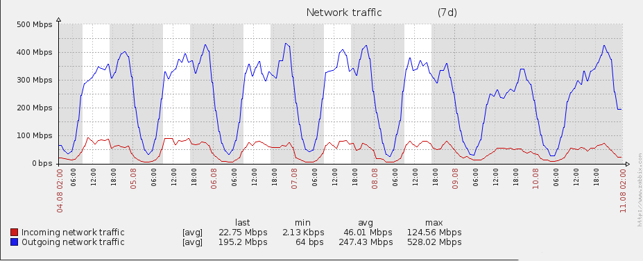
Here is a week inside term.
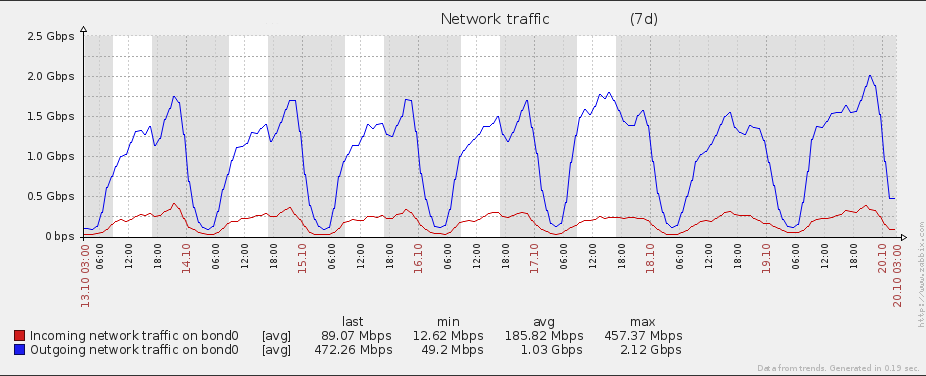
In term time we see a four fold increase in bandwidth throughput. For both graphs there is a definite peak at 2310 on most days (which is repeated week by week) in terms of download rate. If I were someone prone to making wild hypotheses based on only the flimsiest data, I would speculate that students live an average of 10 minutes’ travel from their local pubs. Fortunately, I am not.
These bandwidth graphs are also interesting when coupled with the total number of connected users. There is a rough correlation, but the correlation isn’t strong. There will be more on this later.
As with the number of clients connected, we can drill down to a per college/department level (or frodo level, if you understand the term.) Here is a college chosen at random.
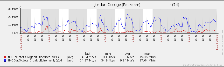
And here is a department
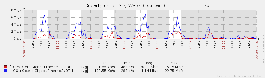
While these are examples, other colleges and departments have similar respective graph profiles. Departments have a clearly defined working week, and usage is minimal outside working hours. Conversely colleges, and the students contained therein have a much fuzzier usage pattern.
The future: what else could be monitored?
Just because you can monitor something doesn’t necessarily mean you should. There is the consideration of system resources consumed in generating and storing the information as well as ethical considerations. Our principal aim is to provide a reliable service. Extra monitored parameters, while potentially interesting, may not help us in that goal.
Saying that, here are some candidates of what we can monitor. Whether we should (or will) is not a discussion we are having at the moment.
Authentication statistics
We currently monitor and alert on eduroam authentication failures for our test user. When this user cannot authenticate, we know about it fairly quickly. However, we collect no statistics on daily authentication patterns:
- Rate of successful authentication attempts
- Rate of failed authentication attempts
- Number of unique users authenticated
If we collected statistics such as these, we would be able to say roughly how many clients (or devices) are associated with a person. Again, this is something we could do, but not necessarily something we would want to know.
Active connections
Every connected device has multiple connections simultaneously flowing through a central point before leaving the confines of Oxford University’s network. For example, you could be streaming a video while uploading a picture and talking on Skype.
This number of active connections is readily available and we could log and monitor it in Zabbix. What we’d do with this number is another matter (just for information, there are 310,000 active connections as I write this, which works out at roughly 15 connections per device using eduroam).
Latency
When you try to connect to a server, there is understandably a delay (or latency) before you receive an acknowledgement of this initial connection from the other end. The best that the laws of physics can offer is twice the distance between your device and the server, divided by the speed of light. Anyone hoping to achieve this level of latency is deluded, but it’s not unreasonable to expect a reply within a hundred milliseconds when contacting a server across the Atlantic from here in Oxford.
On your own network, if you measure all these latencies between any two devices across this network, you can start drawing diagrams to visualize where links are slow. Sometimes high latency is unavoidable, but potentially some of this latency can be removed by choosing a different route across your network between two endpoints, or replacing overworked hardware.
Collecting this latency information and presenting it in a readily understandable format is perhaps not Zabbix’s strongest suit, which is entirely understandable as it was not developed with this in mind. We monitor all switches in the backbone and within that monitoring is link utilization (which is often tightly coupled with latency), but an end-to-end latency measurement is not something we currently do. If we were to do it, most likely it would be using an application better suited to the task.
“One does not simply graph everything”: using the collected data outside of Zabbix
When I asserted that Zabbix tries very hard to graph everything, it was ignoring the fact that it can only graph two dimensional plots with time on the X axis. If you want it to plot something other than time on that axis (e.g. parametric plots) you’re out of luck. Similarly if you want best fit plotting as opposed to a simple line graphs, Zabbix cannot currently do that either.
Fortunately, the data collected by the Zabbix server is stored in a readily accessible format, from which we can extract the bits we want to use for our own purposes. I would like to say now that the following is for general interest only. I am not a mathematician nor a statistician nor do I have a secret hankering to be either and the shallow analyses of these graphs is a testament to that.
That aside, you may be interested in the following…
Here is a graph of data bandwidth utilization over the number of connected clients outside of term time.
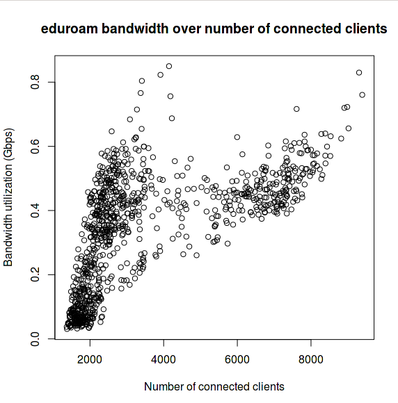
At around 5000 connected clients, there is a jump and the bandwidth utilization scales slower than the number of connected clients. If you look at the graphs mentioned earlier for connected clients over time, you can see that 5000 clients occurs at 0900 in the morning most weekday mornings and 1700 most weekday evenings. We can therefore suppose that there are two main usage patterns to eduroam, one during working hours and one outside. I stress this is during out of term time as we do not yet have enough data for term time usage patterns.
Here is the peak connected clients plotted against the day of the week, again from data taken outside of term. The error bars are one standard deviation.
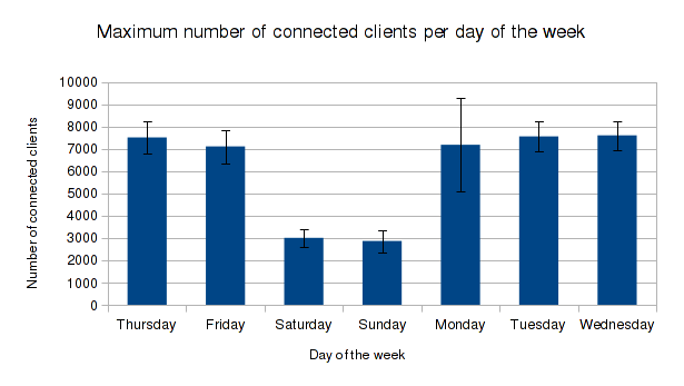
On its own, this is not a particularly insightful graph but it does show you that you can analyze data outside of Zabbix in ways that even the creators of Zabbix perhaps did not anticipate. However, it is interesting to note that weekend bandwidth does not decrease as would be suggested by the clients-connected drop shown in the graph above. In fact, there is no difference outside one standard deviation. We could then conclude that at weekends, fewer people connect, but the bandwidth utilization per head is much greater.
For those curious, I would imagine the greater standard deviation on Monday in the graph above is to account for bank holidays.
Conclusion
There isn’t much to conclude here, other than monitoring can be fun if you want it to be! We have found Zabbix to be a great tool to help us collect data about our services and I hope that this blog post goes some way to showing you what is possible.
Really informative, thank you, Henryk