 As I’m sure you’ve noticed, most pages in WebLearn 11 use a new icon set: Font Awesome icons. You may well recognise these icons from other websites or phone ‘Apps’. Unlike the previous (‘Silk’) icons these are not images, they are, as the name would suggest, a font. This makes them scalable and colourable (if that’s a word).
Font Awesome icons are open source and can be customised in many ways — size, colour, drop shadow, and anything that can be done with the power of CSS. They can even be made to spin around if that’s one of your hobbies.
Using Font Awesome icons on your pages
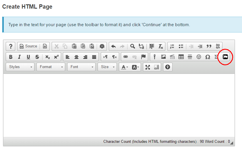
To add a Font Awesome Icon to a WebLearn page, open the HTML editor and locate the Font Awesome ‘flag’ icon at the end of the middle row (when using WebLearn on a desktop machine).

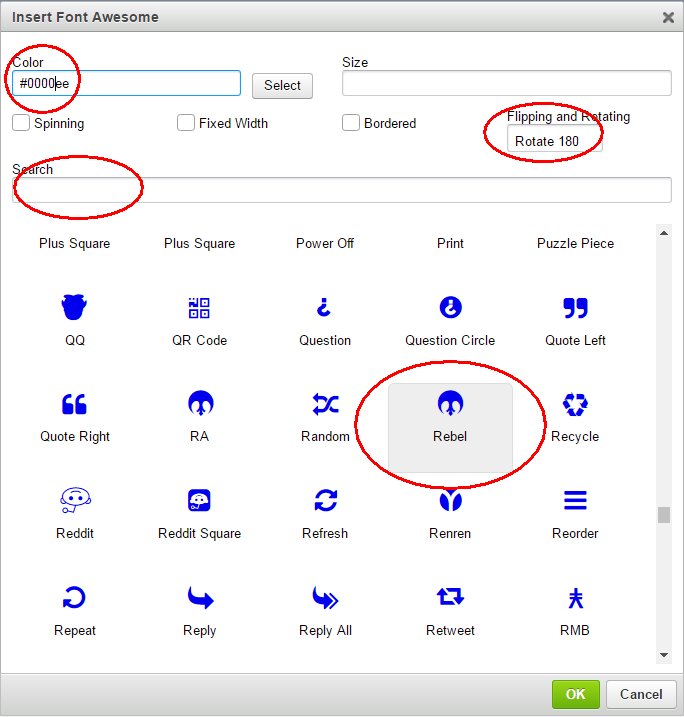
You can then select a suitable icon, either search by name or browse by using the scroll bars.

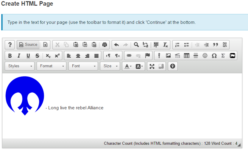
Basic customisation can be effected whilst using the picker but you can use any CSS directives via the “Source” view of the HTML WYSIWYG editor.

That’s all there is too it. Don’t go too crazy with the spinning though!