Thanks to Andy Cotgreave for writing most of this article.
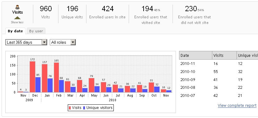
Site Stats is a fantastic WebLearn tool. Once added to a site, it will track all activity within that site and can produce colourful pie charts and histograms of predefined user activity. In addition, it is possible to set up customised reports focussing on particular areas of interest. The raw data used to produce the reports can be downloaded in a format that can be used by a spreadsheet or equivalent package. A link is given below to the step-by-step guide which explains how to use the tool.
The tool does have limitations. Sometimes pie charts and histograms are not the most intuitive way of presenting the data and this is a situation when it is very useful to be able to download the data and manipulate it in a separate program such as Microsoft Excel.
The visualisation facilities of Excel may be very useful in many situations, however, members of UAS have requirements that exceed the capabilities of Excel and, after surveying the landscape, have decided the use a piece of visualisation software called Tableau.
From the Tableau website: Taylor Hawes, Microsoft’s Controller for Global Platforms said it well, “At Microsoft, we use Excel spreadsheets and Pivot Tables to perform detailed analysis. However, Tableau has enabled us to bring analytics to a completely new level.”
Tableau allows complex reporting dashboards to be built complete with active buttons which instantaneously filter the charts giving a much better user experience. In addition, the charts complete with active buttons can be published onto the web with the minimum of fuss.
Now over to Andy ………
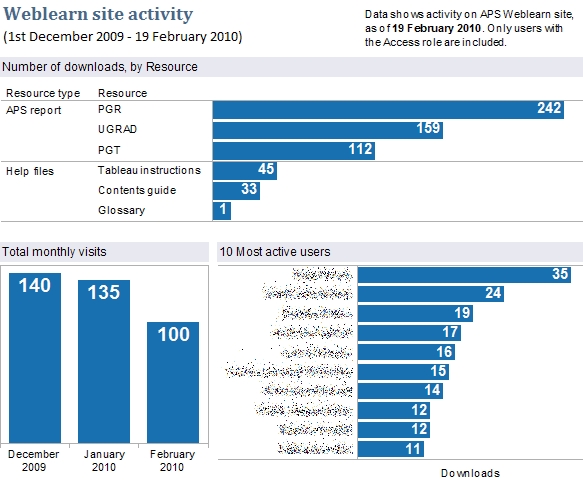
I’m doing a report for management about how often our Annual Programme Stats data is being looked at. To do this, I’ve created a few reports on the APS Weblearn site. I can export those as CSVs and then connect Tableau to them to create a dashboard as follows:
It’s pretty easy to do this, and Tableau gives us more flexibility in the way we can display the data. I hadn’t really played with the custom reports features before, but there’s some good features in there.
Links
- Site Stats tool
- Site Stats Step-by-step guide
- Tableau website
- Tableau and Excel
- Tableau product tour video (this is worth it if only for the extreme Americanness of the presenter!)

